Tuesday, April 23, 2013
Wednesday, April 17, 2013
Art Event: Department of Art and Art History SMP Show 2013
Michael Bargamian, Chance Hazelton and Amanda Schmeltz are currently exhibited in Boyden Gallery. Seeing as they are all seniors here at St. Mary's they are showing their St. Mary's Projects as well as speaking on them. The exhibit opened Monday, April 15th and will be open until Saturday, April 20th.
Michael Bargamian, know to many as Mikey-B, is addressing mankind's dependency on written word. He states that "words are controlling us constantly and we often become dependent on this manipulation in order to function in our modern world". In order for the audience to question their perception of written word Mikey-B has left the second half of sentences scrawled into his work illegible. Because of this the viewer can never fully grasp what he has written, and instead has to ponder potential phrases and interpretations. In my opinion this makes the piece partially the viewer's; the artistic projection and the viewer's interpretation become an interactive art piece.
I am a huge fan of Mikey as both a being and an artist. I believe the concept and aesthetic he is aiming for is achieved and even surpassed. The simple color palettes and somewhat messy mediums used in producing his art contrast the complex and ordered state of language. Upon viewing the exhibit I did question what many of the pieces said and turned it over in my mind for a while. When I found out that was the point I kind of laughed a bit; his work was definitely effective.
Overflow, Amanda Schmeltz's installation, is a site-specific installation formed from circle cutouts and painted circles. Her aim is to express the comfort, relief and awe she experiences in relation to her Christian faith. She hopes to have the audience "reflect upon their own sense of self in relation to their surrounding world, just as Christianity beckons [her] into a reflection about [herself] in [her] environment." I would say that Amanda is both aesthetically and conceptually successful in her installation. The blue circles are calming as well as overwhelming; from what I know of her efforts behind this piece her relationship with God is quite similar. Viewing this installation was humbling because of it's size. Personally, when anything is large enough to walk through and under I feel a greater connection due to physically interacting with the piece.
Chance Hazelton's aim is to "remind people to stop speeding through life and finding shortcuts and instead reinvigorate your relationship with the world around you." Today we are flooded with images and symbols that are synonymous with words and phrases. Rather than appreciating our surroundings strictly for their visual value, we speed past them and have quantitative, not qualitative, interactions. Chance constructed three images using a variety of multi-media tools. Her goal was to breakdown ordinary landscapes into something unfamiliar through "removing color, inducing an extreme linear perspective and including collaged reproductions of the images." I believe Chance was successful in unfamiliarizing a landscape, causing the viewer to linger and appreciate their surroundings rather than pass them by.
Overall this exhibit was awesome to attend and it was great to see friends exhilarated by their final project.
Hopefully I will have the pleasure of viewing some of their future work.
Sunday, April 14, 2013
Chris Coyier: Web Designer
Chris Coyier, a web designer from Verona, Wisconsin, is the founder of the site CSS-Tricks. In middle school he identified himself as a nerd. The combination of his love for computers and passion for art is perfect for web design; he thinks "of design as the perfect compromise between art and computer nerdery." Since getting into the field he has worked for multiple agencies including SurveyMonkey and Wufoo, stating that a motivating factor in his work is "encouragement from the community on all the things [he does]. That gets addictive."
Outside of web design and developing Chris enjoys playing a variety of acoustic instruments. He is relieved to finally be at the point of competence where playing music is relaxing, and no longer frustrating. Other than that he likes "a lot of normal people things like live music, good TV, good movies, sporting events, good food etc."

Coyier's current website, CSS-Tricks, is all about how to make functional, aesthetically pleasing websites. CSS-Tricks includes everything from demo videos to forums and also has a gallery of web pages and digital art. Under the snippets tab, viewers can find coding for html, CSS, htaccess, PHP. javascript, jQuery and Wordpress. A tab that I personally consider incredibly useful is the Almanac. It contains an A to Z list of CSS selectors and properties. This seems like a helpful tool for individuals like myself who need to navigate the unfamiliar waters of web design.

Visually I think that Coyier's site is wonderful but I have no idea what any of the posts are about. I assume that his goal of assisting in the design and development of web pages is being achieved, seeing as there are countless tutorials and posts that I don't understand a lick of. The primary and secondary colors he uses throughout the site make certain areas pop and draw the eye. The site is also easily navigable and user-friendly. However, for someone unfamiliar with web design, the blocks of confusing text are a bit unsettling. I think breaking posts up with images or filler color would be a nice addition. Other than that Chris Coyier's site is quite lovely.
Sunday, March 31, 2013

Vito Acconci Reading
"An open public space, like the piazza, is a vast multidirectional space. People are dots sprinkled across the floor; one dot slides into another and slips past another to continue on its own. A number of dots queue up to form a dotted line of tourists who follow a flag and crisscross another dotted line of tourists. Here and there, as if scattered through a sea, dots merge together into islands. It's every person for him- or herself here, every group for itself, and the tower above all. The space is public, but the people in it don't function as a public. In order for public space to be a gathering place, where all the people are gathered together as a public, it needs a gathering point. To be seen and read as a public, to act and/or be used as a public, the dots have to form a circle, as if around a point; or they have to form a line, as if toward a point; or they have to blend together so that they form a point themselves, which blots and spreads out to cover the piazza floor."

Space as public, but people not functioning as a public can be true but is also reversible. The individual 'dots' forming the public, once open to meeting each other do 'form a point themselves'. I wonder if it is possible for this larger point, or larger interaction, to lose boundaries. I feel that in order to do so, individuals would have to loosen their grip on the self and be open to individuals and experiences beyond their comfort zones and possibly their understanding.
Tuesday, March 26, 2013
Artist Talk- Natalia González Requena
Natalia González Requena is an artist from Santa Cruz, Bolivia living and working part time out of Pittsburgh, Pennsylvania. In 2002 Natalia obtained a licentiate in Fine Arts at the Pontifical Catholic University in Santiago, Chile. She then went on to get both a Master of Fine Arts in studio art and a Certificate in the College Teaching of Art from the Maryland Institute College of Art, in Baltimore, Maryland. Natalia has instructed courses at the NUR University in Bolivia and the UPSA University in Santa Cruz. She has had numerous installations and exhibitions in Santa Cruz, Baltimore, Philadelphia, Buenes Aires and various other locations.
Natalia's work is structured by three components: body, time, and space. Much of her work involves recordings, which she considers "as a trace of interactions in a field of experience." The body becomes the subject of the experience, time the continuum that holds the events, and space interacts with the relative position and direction of everything. "The use of recording equipment, video or audio, goes beyond the role of documentation by expanding into the category of drawing."
I can definitely understand and appreciate Natalia's fascination and investigation of the relationship between body, time and space. However, had this not been explained to me, I would have had no idea what her art was supposed to convey. I am curious as to whether there are written explanations at her exhibits or if it her exhibits are left open to interpretation. An aspect of her artwork that I enjoy is her use of deskilled media, or using materials in unusual ways. An example of this is using a projection screen as a light source, rather than as a mode to project a large image.
Natalia worked alongside Valentina Bacherer on Borrowed Time, an awarded installation exhibited at the XVIII Biennial in Santa Cruz, Bolivia. In this exhibit she took photographs of neighborhood guards sitting in the chairs they occupy while on watch. She then gave the guards new chairs in exchange for their old ones. The chairs were then displayed in front of the photos taken. Of all her pieces, this is my favorite. I find the tattered, pieced together chairs and images of the men beautiful. They are both worn with age and experience, but give hope for safety through their reliability.

Thursday, March 21, 2013


Thursday, March 7, 2013


Wednesday, February 27, 2013
Tom Whalen
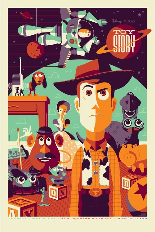
Tom Whalen, who is known as StrongStuff on the web, hails from McAdoo, Pennsylvania. He grew up helping his Grandmother, the owner of a candy shop, on Sundays in her store. There was a large rack of comics that he would spend all day reading, and upon his return home he would practice drawing characters from these stories on the drafting table handed down to him from his father. He credits this as "the origin of [his] drawing career." He had no formal art training until attending Kutztown University in Pennsylvania. Whalen has been gaining notoriety in the vector art world for the last five years with the help of DeviantArt, The Cartoonist Society of Philadelphia, and The Autumn Society. Whalen finds inspiration in "comic books, poster art, movies, pop art, toy packaging, stained glass and religion textbooks from [his] childhood."
In an interview Whalen states that his least favorite part of the design and illustration industry is "the proliferation of desktop publishing. There’s a lot of bad design out there. Just because you might have access to a steam shovel doesn’t mean you’re qualified to use it." Who is he to judge the value of another's piece of art? If an individual is enjoying programs such as adobe illustrator, no matter how simply, they should be appreciated solely for their drive to create something. After all, how does one get better at something without starting off small? And hey, if I had access to a steam shovel I would try it out just to try it out.

Honestly, I see little to no meaning behind Whalen's work other than aesthetic value. I could say that his simple color palate and smooth lines represent the sameness that we share and natural harmony in the world, but I do not genuinely believe that. I feel that he is simply creating something nice to look at. This being said, the meaning behind what is displayed in the image likely has an influence. For example, the Star Wars poster incorporates a lot of black and white; the movie is about the struggle between good and evil. Other than the actual image being displayed, I feel the only real intention behind Whalen's work is to make a cohesive and aesthetically pleasing image.
I really enjoy the concept and aesthetic quality of Whalen's work. The simplified shapes and color palette makes those presented appear even stronger. The colors chosen for many of his pieces are muted blues, greens, and oranges which compliment each other greatly. I think the color palette he chooses to work with combined with the style of his vector art give a very vintage feel to the posters. This influences the viewer; they may possibly be feeling nostalgia towards their childhood, I know I did when I saw the Toy Story image.
I do not have any critiques for Whalen's work; most to all of it looks good to me. I think the simplicity of larger figures, such as Yoda below, balance out the detail in smaller figures, such as the storm-trooper. I had the pleasure of finding Whalen's work simply by googling "vector artist". I believe he is fairly popular in the vector art scene, gaining notoriety and even having gallery shows. In September he had a two-man gallery show with a fellow artist, called "Around the World in an 80's Daze" at gallery 1988.

Monday, February 25, 2013
Progress!

Original vs where I currently am in Adobe Illustrator. It's a lil creepy right now but after I add more detail it will begin to look more realistic. I'm going back to fix the teeth and add highlights/shadows to them as well as the hair. She is also waiting for eyelashes on one eye, her body and a background.

Worked on it a bit more!

Tuesday, February 19, 2013
Music Line Drawing

I produced this image in response to a piece of music presented by Professor Friebele. The program I used is called Adobe Illustrator. I can't find the song right now, but when I do I'll post it under the image so you can see if your visual response to the music runs parallel to mine.
Technological Dystopia

This image was created from approximately 30 other images with the help of the various tools available on photoshop.

Portraits
My sister, Katie

The little boy I babysit, Lawrencey

A friend, Brady

My sister, Katie

Taken by a friend, Me
Georg Nees

George Nees, a pioneering artist in the world of digital art, began interacting with computers in 1959 at the age of 33. At the time he was a software engineer and industrial mechanic at Siemens AG in Erlangen, Germany. In 1964 Nees began to experiment with the artistic application of programming to graphics, sculptures and films. The same year Nees began working towards a degree in philosophy at the Universities of Erlangen-Nürnberg and Stuttgart. Since then Nees has been producing computer art and theorizing about it using his background in philosophy.
Nees is likely the first digital artist to present drawings "algorithmically generated by a digital computer under program control." These drawings were originally shown at the University of Stuttgart from February 4th to February 19th, 1965. I find it slightly ironic that this artist post is due on February 19th. Nees, along with two digital artists, Noll and Nake, are included in what is called the "three big N's" of computer art. All three had digital art shows in the year 1965 and heavily influenced following computer artists. The program Nees initially wrote in is called ALGOL; it uses random number generators to pull numbers which then send signals to a Graphomat Z64, a flat-bed pen plotter. In order to actually produce the art that he intended to produce Nees wrote multiple programs which extended the controls of the ALGOL programming language, including G1, G2, and G3. Because of his highly accomplished past in computer programming, Nees was awarded the title of honorary professor at the University of Erlangen.
Nees is likely the first digital artist to present drawings "algorithmically generated by a digital computer under program control." These drawings were originally shown at the University of Stuttgart from February 4th to February 19th, 1965. I find it slightly ironic that this artist post is due on February 19th. Nees, along with two digital artists, Noll and Nake, are included in what is called the "three big N's" of computer art. All three had digital art shows in the year 1965 and heavily influenced following computer artists. The program Nees initially wrote in is called ALGOL; it uses random number generators to pull numbers which then send signals to a Graphomat Z64, a flat-bed pen plotter. In order to actually produce the art that he intended to produce Nees wrote multiple programs which extended the controls of the ALGOL programming language, including G1, G2, and G3. Because of his highly accomplished past in computer programming, Nees was awarded the title of honorary professor at the University of Erlangen.

I read into much of Georg Nees' work as the visualization of the relationship between chaos and order. The use of computer programs and algorithms are seemingly orderly ideas to me. They are very straight forward and leave little room for flexibility. However, the products of these programs and algorithms are very chaotic. Only the codes know where the next lines will be placed. I may not be entirely correct in saying this, seeing as I am not all that familiar with programming, but that is how I interpret Nees' art practices. The straight lines and consistent shading found in Nees' work are crisp; his work is clean. The overlapping of numerous lines and sporadic placement of shapes contrasts this orderliness greatly and provides and interesting mix. I think the overall effect created is very balanced; the world needs both order and chaos.
For example, the first work featuring squares involves a gradual change from parallel boxes to off-kilter scattered boxes. While this change begins subtly, the chaos builds until a pattern in the blocks is no longer recognizable. Even then, the chaos of the changing blocks is contained to one area, helping to organize it. This could be representative of a greater force behind the workings of the world.

I personally really enjoy and respect this form of art. I don't entirely understand the process of making it, but I feel that that definitely adds to the mystique. I do think that there is a stopping point for this kind of art, and Nees seems to have found relatively good places to halt the programs. Then again, he may have let them run in full, I just don't know. If he did interfere and stop mid-program processing, I think it was a good decision. If any more was included in all three of these pieces they would feel busy and overwhelming. They still are busy, just not too busy.
I discovered Georg Nees' work through the article posted on blackboard by Paul Hertz, Art, Code and the Engine of Change. Overall I was impressed with the ways in which people manipulate computers in order to produce pieces of art.
Monday, February 4, 2013
Anthony F. Schepperd
EyesDown
Anthony Francisco Schepperd is a 2-D animator currently living and working in Philadelphia. His interest in animation was sparked at the age of 11 while attending a summer camp. While Schepperd drew throughout his childhood, until recently his efforts were geared towards traditional painting. Schepperd used to see animation as an immature art form; traditional painting was the well respected route he planned to take. When he was asked to produce an animation for a music video three years ago, Schepperd rediscovered the love he has towards the relationship between movement in animation and music. He now works creating music videos, short sketches, and advertisements using tablets and various programs such as TVPaint.
I interpret Schepperd's work as being heavily influenced by environmentalism. In Two Against One, the man's life falls apart after he kills a deer; he may, in a sense, be killing the spirit of the forest. This comes back to haunt him. EyesDown may be viewed as technology's struggle to coexist with the natural world. Nature survives in the end (the somewhat barren plain) and there are still slight flickers of technology; progress can fall apart but never entirely be reversed. The Music Scene, my favorite of the three videos, is somewhat blunt about the destructive road technologic progress is currently on. We endlessly consume resources only to expel waste (the apples being shredded). Nature ends up failing us because we have exhausted it; we cannot forget the roots of our progress (pun intended).
I had the pleasure of being exposed to Schepperd's work when a friend showed me the music video for The Music Scene. Soon after I watched his other videos and fell in love with his animation. The fluidity of changing shapes paired in time with the music is a fantastic sensory experience. I also really enjoy the high contrast between dull and bright colors throughout most of his videos. I look forward to viewing more of his work in the future.
Two Against One
The Music Scene
Thursday, January 31, 2013
Composite Portrait (Rough)

The perfect combination of man.....James Franco and Garrett Hedlund (Tron, 2010).
Sparkling Eyes-Garrett Hedlund
Flowing Hair-Garrett Hedlund
Lovely Face-James Franco
Feisty 'stache-Garrett Hedlund
Man Beard-Garrett Hedlund
Ferocious Bear- A Poor Soul


Tuesday, January 29, 2013
Before and After Edits

I messed around with the exposure, levels, and hue/saturation. My main edit was increasing the level of red to bring out skin tone.


This image is tiny so it's a bit pixelated, sorry! I adjusted the brightness and contrast, curves, levels and shadows and highlights. Shadows and highlights were the most important edits made because it brought out definition in our overexposed faces.


Monday, January 28, 2013
Technology Log
6:37 Looked at clock, rolled over
6:58 Checked texts and missed calls, responded to texts
7:23 Looked at clock, got up
7:24 Checked phone
7:25 Checked computer
7:46 Looked at clock
7:48 Responded to text
8:03 Looked at clock
8:15 Turned off alarm
8:16-8:30 Practiced/prepared presentation using computer
8:30-8:32 Surfed the web
8:55 Checked phone
9:03 Checked facebook/email
9:18 Checked phone
9:54-10:07 Presentation using laptop
10:58 Checked phone, responded to text
11:05 Checked phone
11:09 Sent text
11:12 Checked phone/sent texts
11:17 Text
11:19 Text
11:25 Text
11:29 Text
11:31 Text
11:35 Text
11:36-11:43 Surfed the web
11:47 Text
11:52 Text
11:59 Text
12:03 Checked phone
12:13 Checked phone
12:27 Text
12:29 Text
12:35 Text
12:40-12:45 Computer browsing
12:46 Text
12:50 Text
12:51 Set my alarm
12:54 Sent text
1:41-1:48 Internet browsing
1:50-2:04 Phone call
2:24 Checked time on phone
2:27 Checked time on phone
2:31 Sent text
2:38 Checked phone
2:42 Checked email
3:13-3:33 Slideshow in class
3:34 Checked phone
3:36 Sent email
3:40-3:46 Professor showing work on blackboard
3:48 Checked phone
4:06 Text
4:17 Checked phone
4:31 Checked phone, text
4:34 Text
4:47 Text
4:51 Text
5:47 Text
5:48 Text
5:50 Text
5:54 Text
5:56 Checked phone
5:59 Text
6:48 Text
6:50 Text
6:52 Text
6:53 Text
6:57 Text
6:59 Text
7:01 Checked phone
7:04 Text
7:12 Text
7:16-7:21 Computer
7:28-7:34 Phone call
7:36 Checked phone
7:41 Checked time on phone
7:43 Bought tea (register)
7:53 Text
8:05-10:21 Movie for a class
8:08 Text
8:28 Text
8:53 Text
8:54 Text
8:56 Text
9:06 Text
9:07 Text
9:08 Text
9:12 Text
9:14 Text
9:30 Text
9:31 Text
9:37 Checked phone
9:41 Checked phone
9:52 Text
9:53 Text
9:54 Text
10:09 Text
10:12 Text
10:14 Text
10:17 Checked phone
10:19 Checked phone
10:39-10:59 Surfing the web
10:57 Text
10:59 Text
11:02 Set alarm on phone
11:05-11:21 Internet
11:43 Text
11:44 Text
11:45 Text
11:50 Text
12:01 Turned off computer
*I didn't think to include listening to my ipod until bed, but it was likely a total of around 2 hours.
Sunday, January 27, 2013


Wednesday, January 23, 2013
Experimental Scans

Layered Fabrics

Fish (made of scarf, ring, pin and headband)

Hands (everyone who was in the room)

Music Scene (various music-related objects from the room down the hall)

 Enchanted (bandaids and wrappers) Mixed Hair
Flashy (layered books)

Junk (layered jewelry and scarf)

Portrait (profile with braid and shirt layered)

Crisp (jumbled up jewelry)


Leah (hair and fabric layered) Noms (various food waste)
Subscribe to:
Posts (Atom)