Wednesday, February 27, 2013

Tom Whalen


Tom Whalen, who is known as StrongStuff on the web, hails from McAdoo, Pennsylvania.  He grew up helping his Grandmother, the owner of a candy shop, on Sundays in her store.  There was a large rack of comics that he would spend all day reading, and upon his return home he would practice drawing characters from these stories on the drafting table handed down to him from his father.  He credits this as "the origin of [his] drawing career."  He had no formal art training until attending Kutztown University in Pennsylvania.  Whalen has been gaining notoriety in the vector art world for the last five years with the help of DeviantArt, The Cartoonist Society of Philadelphia, and The Autumn Society.  Whalen finds inspiration in "comic books, poster art, movies, pop art, toy packaging, stained glass and religion textbooks from [his] childhood."

In an interview Whalen states that his least favorite part of the design and illustration industry is "the proliferation of desktop publishing. There’s a lot of bad design out there. Just because you might have access to a steam shovel doesn’t mean you’re qualified to use it."  Who is he to judge the value of another's piece of art?  If an individual is enjoying programs such as adobe illustrator, no matter how simply, they should be appreciated solely for their drive to create something.  After all, how does one get better at something without starting off small?  And hey, if I had access to a steam shovel I would try it out just to try it out.


Honestly, I see little to no meaning behind Whalen's work other than aesthetic value.  I could say that his simple color palate and smooth lines represent the sameness that we share and natural harmony in the world, but I do not genuinely believe that.  I feel that he is simply creating something nice to look at.  This being said, the meaning behind what is displayed in the image likely has an influence.  For example, the Star Wars poster incorporates a lot of black and white; the movie is about the struggle between good and evil.  Other than the actual image being displayed, I feel the only real intention behind Whalen's work is to make a cohesive and aesthetically pleasing image.

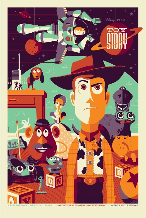
I really enjoy the concept and aesthetic quality of Whalen's work.  The simplified shapes and color palette makes those presented appear even stronger.  The colors chosen for many of his pieces are muted blues, greens, and oranges which compliment each other greatly.  I think the color palette he chooses to work with combined with the style of his vector art give a very vintage feel to the posters.  This influences the viewer; they may possibly be feeling nostalgia towards their childhood, I know I did when I saw the Toy Story image.

I do not have any critiques for Whalen's work; most to all of it looks good to me.  I think the simplicity of larger figures, such as Yoda below, balance out the detail in smaller figures, such as the storm-trooper.  I had the pleasure of finding Whalen's work simply by googling "vector artist".  I believe he is fairly popular in the vector art scene, gaining notoriety and even having gallery shows.  In September he had a two-man gallery show with a fellow artist, called "Around the World in an 80's Daze" at gallery 1988.

Monday, February 25, 2013

Progress!


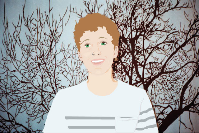
Original vs where I currently am in Adobe Illustrator.  It's a lil creepy right now but after I add more detail it will begin to look more realistic.  I'm going back to fix the teeth and add highlights/shadows to them as well as the hair.  She is also waiting for eyelashes on one eye, her body and a background.


Worked on it a bit more!


Tuesday, February 19, 2013

Music Line Drawing


I produced this image in response to a piece of music presented by Professor Friebele.  The program I used is called Adobe Illustrator.  I can't find the song right now, but when I do I'll post it under the image so you can see if your visual response to the music runs parallel to mine.

Technological Dystopia


This image was created from approximately 30 other images with the help of the various tools available on photoshop.

Line Tracing

Original image credited to M. I.

Portraits


My sister, Katie

The little boy I babysit, Lawrencey

A friend, Brady 

My sister, Katie

Taken by a friend, Me


Georg Nees


George Nees, a pioneering artist in the world of digital art, began interacting with computers in 1959 at the age of 33.  At the time he was a software engineer and industrial mechanic at Siemens AG in Erlangen, Germany.  In 1964 Nees began to experiment with the artistic application of programming to graphics, sculptures and films.  The same year Nees began working towards a degree in philosophy at the Universities of Erlangen-Nürnberg and Stuttgart.  Since then Nees has been producing computer art and theorizing about it using his background in philosophy.


Nees is likely the first digital artist to present drawings "algorithmically generated by a digital computer under program control."  These drawings were originally shown at the University of Stuttgart from February 4th to February 19th, 1965.  I find it slightly ironic that this artist post is due on February 19th.  Nees, along with two digital artists, Noll and Nake, are included in what is called the "three big N's" of computer art.  All three had digital art shows in the year 1965 and heavily influenced following computer artists.  The program Nees initially wrote in is called ALGOL; it uses random number generators to pull numbers which then send signals to a Graphomat Z64, a flat-bed pen plotter.  In order to actually produce the art that he intended to produce Nees wrote multiple programs which extended the controls of the ALGOL programming language, including G1, G2, and G3.  Because of his highly accomplished past in computer programming, Nees was awarded the title of honorary professor at the University of Erlangen.


I read into much of Georg Nees' work as the visualization of the relationship between chaos and order.  The use of computer programs and algorithms are seemingly orderly ideas to me.  They are very straight forward and leave little room for flexibility.  However, the products of these programs and algorithms are very chaotic.  Only the codes know where the next lines will be placed.  I may not be entirely correct in saying this, seeing as I am not all that familiar with programming, but that is how I interpret Nees' art practices.  The straight lines and consistent shading found in Nees' work are crisp; his work is clean.  The overlapping of numerous lines and sporadic placement of shapes contrasts this orderliness greatly and provides and interesting mix.  I think the overall effect created is very balanced;  the world needs both order and chaos.

For example, the first work featuring squares involves a gradual change from parallel boxes to off-kilter scattered boxes.  While this change begins subtly, the chaos builds until a pattern in the blocks is no longer recognizable.  Even then, the chaos of the changing blocks is contained to one area, helping to organize it.  This could be representative of a greater force behind the workings of the world.


I personally really enjoy and respect this form of art.  I don't entirely understand the process of making it, but I feel that that definitely adds to the mystique.  I do think that there is a stopping point for this kind of art, and Nees seems to have found relatively good places to halt the programs.  Then again, he may have let them run in full, I just don't know.  If he did interfere and stop mid-program processing, I think it was a good decision.  If any more was included in all three of these pieces they would feel busy and overwhelming.  They still are busy, just not too busy.

I discovered Georg Nees' work through the article posted on blackboard by Paul Hertz, Art, Code and the Engine of Change.  Overall I was impressed with the ways in which people manipulate computers in order to produce pieces of art.


Monday, February 4, 2013

Anthony F. Schepperd

EyesDown


Anthony Francisco Schepperd is a 2-D animator currently living and working in Philadelphia.  His interest in animation was sparked at the age of 11 while attending a summer camp.  While Schepperd drew throughout his childhood, until recently his efforts were geared towards traditional painting.  Schepperd used to see animation as an immature art form; traditional painting was the well respected route he planned to take.  When he was asked to produce an animation for a music video three years ago, Schepperd rediscovered the love he has towards the relationship between movement in animation and music.  He now works creating music videos, short sketches, and advertisements using tablets and various programs such as TVPaint.


I interpret Schepperd's work as being heavily influenced by environmentalism.  In Two Against One, the man's life falls apart after he kills a deer; he may, in a sense, be killing the spirit of the forest.  This comes back to haunt him.  EyesDown may be viewed as technology's struggle to coexist with the natural world.  Nature survives in the end (the somewhat barren plain) and there are still slight flickers of technology; progress can fall apart but never entirely be reversed.  The Music Scene, my favorite of the three videos, is somewhat blunt about the destructive road technologic progress is currently on.  We endlessly consume resources only to expel waste (the apples being shredded).  Nature ends up failing us because we have exhausted it; we cannot forget the roots of our progress (pun intended).


I had the pleasure of being exposed to Schepperd's work when a friend showed me the music video for The Music Scene.  Soon after I watched his other videos and fell in love with his animation.  The fluidity of changing shapes paired in time with the music is a fantastic sensory experience.  I also really enjoy the high contrast between dull and bright colors throughout most of his videos.  I look forward to viewing more of his work in the future.


Two Against One


The Music Scene